Exploring Data: Percentiles, Skewness, and Correlation
This chapter in Surviving Statatistics explains measures of Position including median, percentiles, and deciles.
Note: This chapter is excerpted from Luther Maddy’s Surviving Statistics textbook (C) 2024 which is available in printed or eBook format from Amazon.com
Instructional Videos
Surviving Statistics: Percentiles, Skewness & Correlation
Business Statistics: Locating Percentiles
Surviving Statistics - File Downloads
Lemonade Sales Scatterplot
Exploring Data
Measures of Position
We have already explored one measure of position, the median. The median, you should recall, is the middle point with 50% of the data above and 50% below the median. We can also refer to the median as the 50th percentile. We often describe data in terms of percentiles. Whether it is an SAT or other standardized test score, the height of a toddler, or an IQ measurement, the results are usually reported in percentiles. Reporting something as being in the 98th percentile means that only 2% of the items or individuals in that sample or population have higher values. Similarly, 98% of the members of the sample or population have lower values.
When working with measures of position you may hear the terms quartile and decile in addition to percentile. Quartiles measure the location in quarters, 25th, 50th, 75th, while deciles measure in 10ths. The median can be expressed as the 2nd quartile, or the 5th decile, and the 50th percentile.
The first step in finding the location of a percentile is to sort the data in ascending order, just as we did when we discussed the median.
Next, we find the location using this formula, where P is the percentile you want to locate.
Let’s try some examples.
1. Find the location of the 25th percentile, the 1st quartile:
2. Find the location of the 90th percentile, the 9th decile:
LOCATION VS. VALUE
When working with measures of position, it is important to note that this is a two-step process. The formula to determine the position should not be confused with the value at that position, which you may also need to determine.
Let’s try some examples.
1. Find the value associated with the 25th percentile, 1st quartile:
First, we find the location. We did this earlier and calculated the location to be 3.25. So, the value of the 25th percentile is a number between the value at position 3 and the value at position 4.
We compute the value of location 3.25 by multiplying the difference of the values at 3 and 4 by .25. Then, we add the result to the value at position 3. The value of the 25th percentile then is:
71 + .25(74 – 71) = 71.75
Our example dataset does not have an exact value at the 25th percentile, but this is the calculated value of the 25th percentile.
2. Find the location of the 90th percentile, 9th decile:
We computed the location earlier with, (13) 90/100 = 11.7.
This informs us that the value of the 90th percentile is the value at position 11, plus .70 times the difference between that value and the value at location 12.
The value at location #11 is 98. The value at location #12 is 100. The value of the 90th percentile is:
98 + .70(100 – 98) = 99.4
Skewness
Data does not always follow a symmetrical normal curve, such as the curve in the center of Figure 20. When the data is symmetric, the median and the mean are the same. The illustration on the left is negatively skewed, which means the mean is smaller than the median (negatively skewed). The curve on the right, is positively skewed, which indicates the mean is larger than the median.
Drawing curves of our datasets could give us some indication that our data is skewed. Because determining the degree of skewness would be difficult to do just by looking at the curve, there are some formulas that allow us to numerically determine the direction and level of skewness in our data.
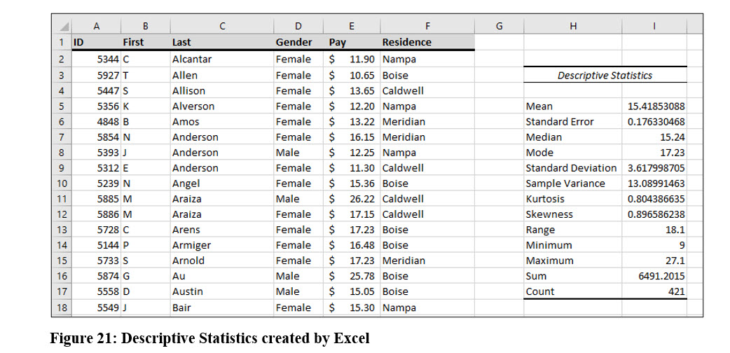
In chapter two, we introduced the Pay Survey data file with 421 observations. If you examine the descriptive statistics table created by Excel in Figure 21, you will see that that mean is slightly larger than the median in this dataset. This indicates that this data is positively skewed, but the difference is small, so we know it is at least slightly skewed. In the descriptive statistics, you will see it that Excel also computed a skewness value of .8965, a small positive number. Skewness values of less than -1 or greater than 1 indicate the data is highly skewed, either negatively or positively.
We will examine two different methods to compute skewness. Sometimes they will produce slightly different results. We will look at the Pearson’s coefficient of skewness and the method software programs such as Excel use.
PEARSON’S COEFFICIENT OF SKEWNESS
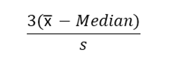
Pearson’s coefficient uses both the median and the standard deviation to compute skewness.
Using the values in the Pay Survey data file, skewness is computed as:
This value does not match the number Excel computed, but both skewness values indicate the data is slightly positively skewed.
SOFTWARE SKEWNESS COMPUTATION
This formula requires a few more computations than the Pearson’s method, but is easy to use with software programs like Excel.
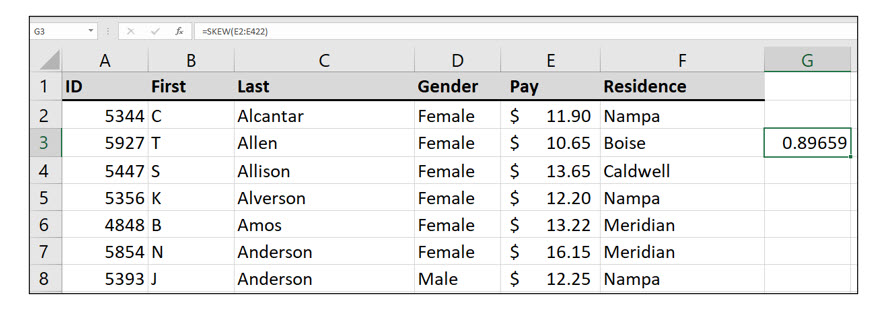
Try it in Excel:
You can access Excel’s Skew() function in the Statistical function category or by simply typing the function.
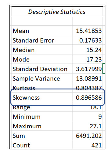
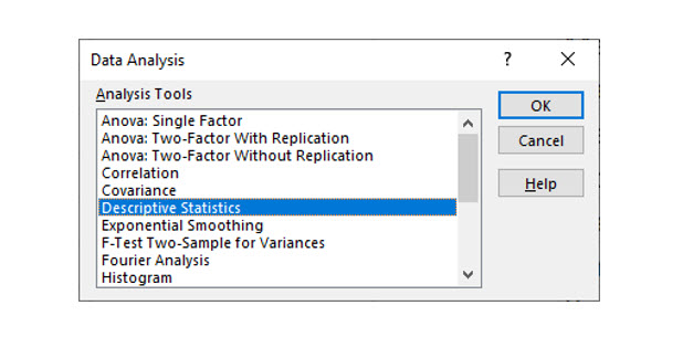
Excel also has a Descriptive Statistics summary function available with the Analysis Toolpak add-in. This add-in is included with Excel but must be enabled to use it.
Relationships between Two Variables
Statistical analysis is often used to determine if two or more variables are related in any way. For example, if you sell hot dogs on a street corner, it would probably be safe to assume there is a relationship between the number of dogs you sell each day and the number of people that walk past your stand. Placing your hot dog stand on a street with no traffic would not be a smart business move.
A SCATTER PLOT
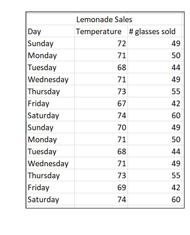
One way to describe a relationship between two variables is to create a scatter diagram that plots both variables. Let’s move from hot dogs to lemonade. Larry runs a lemonade stand. The table displays the daily high temperature and the number of glasses Larry sold for two weeks. It seems likely that a relationship exists between the daily high temperature and the amount of lemonade sold.
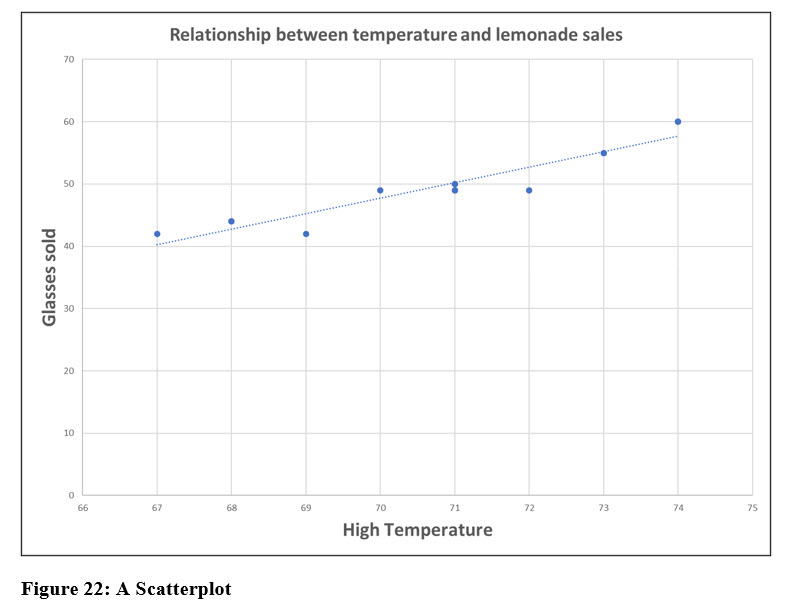
Scatter plots are useful tools to find correlations between variables. Although you can create a scatter plot on your own, tools like Excel make the process easier. Figure 22 shows a plot of the two variables, the number of glasses sold and the daily high temperature. The linear trend line, a feature of Excel, clearly indicate a relationship between these two variables.
CORRELATION COEFFICIENT
The correlation coefficient is a value that numerically represents the relationship displayed in the scatter plot. The value expresses how strong the relationship or correlation is between two or more variables. The correlation coefficient, r, between the temperature and amount of lemonade Larry is 0.948. This indicates a very strong positive relationship between these two variables. We can clearly see this relationship in the scatter plot in Figure 22. You will learn how to compute a correlation coefficient in an upcoming chapter.
Try it in Excel:
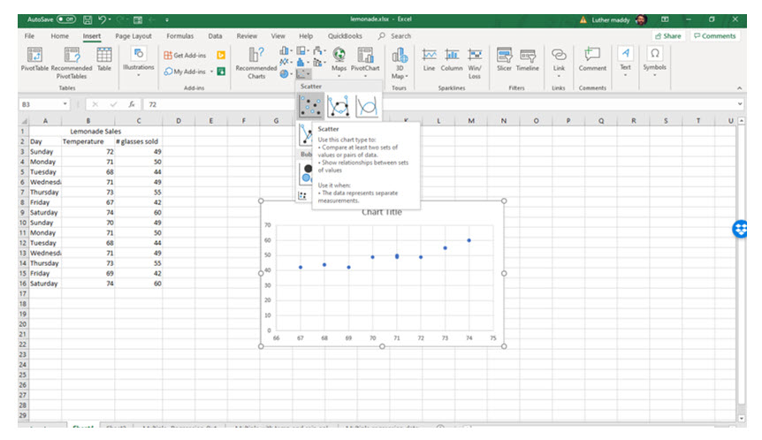
You can easily create a scatterplot in Excel by selecting the two variables and then choosing Scatter from the Charts group on the Insert tab.


