Creating Charts & Graphs
This lesson contains easy to follow step-by-step instructions and videos help you learn to create Bar and Pie charts with your Excel data. You will also learn to add additional elements to your charts to make them more useful.
Note: These instructions are excerpted from Luther Maddy’s Excel Workbooks (C) 2024 which are available in printed or eBook format from Amazon.com
Watch the video-Creating Charts and Graphs from Excel data
Download Excel Graphs Exercise File
Creating Graphs
After you have created a spreadsheet and entered data in it, you can easily use Excel to create charts and graphs of that information. In this lesson you will use Excel’s chart feature to create graphs.
The first step in creating a chart is to decide what you want to graph and what kind of chart you want to use. Not all data is compatible with all chart types, for example, Pie Charts are useful in displaying the makeup of an entire unit. Column and Bar charts are useful for comparisons and Line charts are most often used for viewing a trend over time. There are also variations within each major chart category.
After deciding what kind of chart to use, you should then make sure you have the correct values in the workbook. After ensuring this, the next step is to select the cells that you want the graph to chart. After doing this, you will then choose the chart category you wish to insert from the Charts group on the Insert tab.
1. Open the Charts and Graphs exercise file.
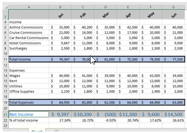
You will now create a column chart that displays each month’s net income.
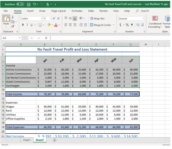
2. Select cells A3 through G3.
You selected the month names that will appear as the column labels on this chart. You started with column A because you want a label from column A in the range of values you are about to select to also appear on the chart.
3. Press and hold the (Control) key and then click and drag to select cells A21 through G21.
Holding down the (control) key allows you to select two separate (non-contiguous) cell ranges in this worksheet. You included the label, “Net Income” in column A as well as the month’s net incomes because this label should appear on the graph.
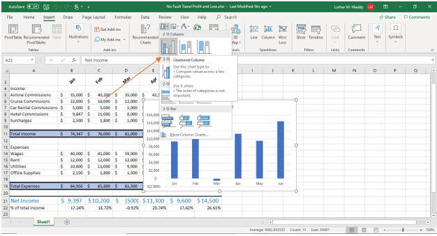
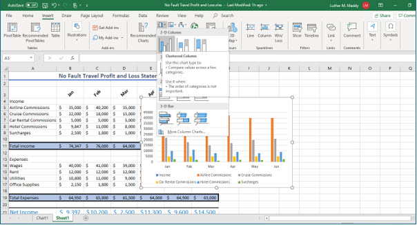
4. With these cells selected, click the Insert tab, then click Column in the Charts group.
Now you can choose the type of chart you want and other options very easily.
5. In the Column style, choose the first sub chart in the 2D column group, Clustered Column.
As you can see here, there are several varieties of charts you can create. Excel will build your chart for you on the active worksheet as a floating object. As a floating object, you can move the chart to a new location and change its size. In this lesson however, you will move the chart to a sheet by itself. This allows you to see that chart as it will appear when printed alone. If you want to print the data and the chart, then leaving it on the worksheet with the values you are graphing is a good idea.
Moving a chart
We will now move the chart to a separate worksheet so it no longer interferes with the worksheet data.
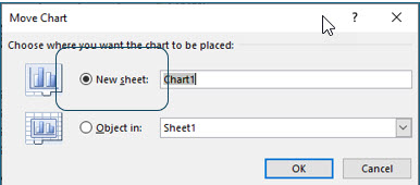
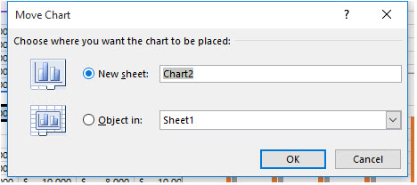
6. Click the Design tab from Chart Tools, then click the Move Chart tool. Select the “New sheet” option and then click OK.
The Move Chart dialog box also allows you to name the chart sheet. Naming and working with multiple worksheets is covered in the next level workbook. By default, Excel will name the first chart, Chart1 and increment the name as you add additional charts.
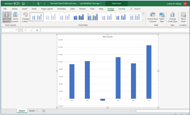
You should now see the completed chart in a sheet by itself. If you examine the sheet tabs at the bottom of the window, you will see that Excel added a tab labeled Chart1. The Sheet1 worksheet contains the data you used to create the chart. Clicking a tab’s name switches to that sheet.
Data Labels
Among the many enhancements you can add to Excel charts are data labels. Data Labels allow you to add the value or information for each column of the chart. You will now add Data labels to the top of each column in this chart.
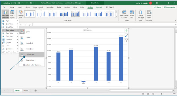
7. Ensure the Design tab is active then click the Add Chart Element tool, select Data Labels and then choose Outside End.
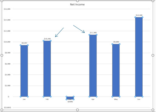
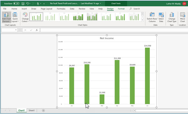
You should see that Excel added a value just outside the end of each column.
Modifying a Chart
After you have created a chart, you may wish to change its appearance. For example, you may want to use different colors or change fonts or make other changes.
Altering elements on an existing graph is very easy. In this portion of the lesson, you will change the appearance of this graph.
1. Click on any of the monthly columns in this chart.
You should notice that all of the bars now have small circles at their tops and bottoms. This lets you know that you have selected all the bars, not just one single bar.
The sizing handles (the small circles at the top and bottom of the columns) tell you this element of the chart is selected. Any formatting changes you make will affect the selected element, in this case the columns.
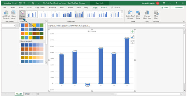
2. Click the Change Colors tool on the Design tab.
You will now see colors available to fill the columns with. In addition to choosing a color here, you can also experiment with additional Fill options such as adding a texture or gradient fill style. For now, you’ll just change the color of the chart columns.
3. In the colors available, click Green, Colorful Palette 4 in the first column of color schemes, fourth row down.
The columns in the color schemes represent series at each data point. There is only one data series here, net income, so the first color in the color scheme row changes all the columns in the chart to that color. You will work with multiple data series shortly.
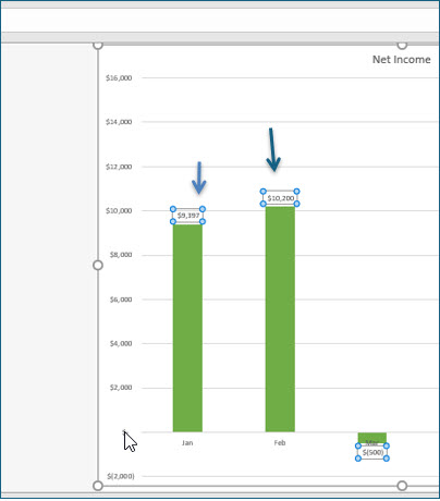
Every column in the chart should now have changed to the green color. Next, you’ll enhance the appearance of the data labels by first selecting them and then applying the enhancement.
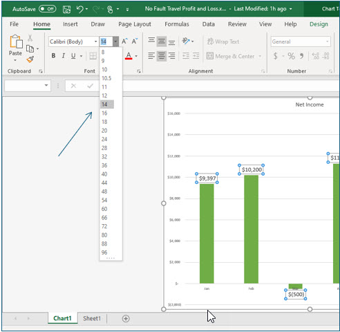
4. Click on one of the values (data labels) above any column.
You should see sizing handles around all the data labels, informing you that this element is now selected. You will now change the font size of the data labels.
5. Display the Home tab and then click the Font Size drop down list. Choose 14 points as the font size.
The data labels should now be larger, displaying in 14 point type.
Now, you’ll change the size of this chart’s title.
6. Click the chart’s title to select it.
Once again the sizing handles tell you the title is selected.
7. Use the Font Size drop down list and change the font size to 20 points.
The title should now display in 20-point type.
The graph is now complete. When you save the worksheet, Excel will also save the graph. The graph is also dynamic. This means that it will change automatically if the data on the worksheet changes. You will now change data on the worksheet and verify that the graph does change.
8. Click the Sheet1 tab to return to the No Fault Travel P&L worksheet.
9. Change cell D6, March Cruise Commissions, to $15,000.
10. Click on the Chart1 sheet tab and view the graph.
The graph has instantly changed to reflect the new values in the worksheet.
Working with Chart Types
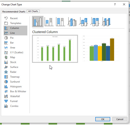
Even after creating a chart, you can still change the type if you want. To do this, select the chart object, then display the Design tab and choose Change Chart type. Excel will then display the types of charts available. In this portion of the exercise you will change the chart type to Line.
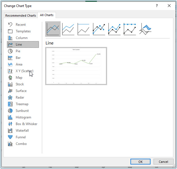
1. Display the Design tab and click the Change Chart Type tool.
You should now see the Change Chart Type dialog box.
2. In the Change Chart Type dialog box, choose Line as the chart type. Choose the first subtype and click OK.
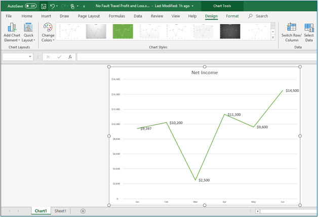
Excel has now changed the chart into a line chart. Line charts are most often used to graphically display trends.
You will now change the chart back to a column chart so you can add a trend line, another very useful feature of creating charts in Excel. Trendlines cannot be added to line charts, so you’ll change the chart type back to column.
3. Click the Change Chart Type tool again and change the chart type back to Column.
Choose the first sub type (not 3-D) in the first column.
Adding a Trendline
If you are using a 2-D chart, you can have Excel compute and graph a trendline. Excel will not add trendlines to 3-D charts. To add a trendline you must first select the data series for which you want to compute a trendline. In this chart there is only one data series. After selecting the data series, choose Trend Line in the Chart Tools group.
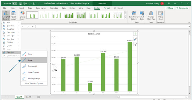
1. While viewing the chart, click the Add Chart Element tool and then select Trendline.
2. From the list of trendlines, choose the Linear option.
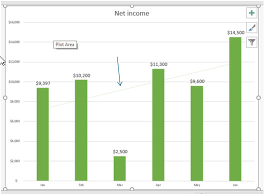
You should now see that Excel has computed and charted a trendline for the net profit. Depending on your monitor and color scheme, the trendline may appear very lightly in the chart.
Charting Multiple Data Series
The chart you just created has only one set of columns or data series. If you need to chart more than one data series, simply select all the data then choose a chart type. In this portion of the lesson you will create a chart that graphs all of the income categories. Since there is more than one income category, the result will be multiple data series on this chart.
1. Click on the Sheet1 tab to return to the No Fault Travel worksheet.
2. Select A3 through G9.
Do not select row 11.
You have included the labels in column A and row 3 so they will also be included on the chart.
3. Display the Insert tab then click Column in the Chart group. Select the first 2D column chart
You have selected a 2D column chart, the same type you used for the other chart.
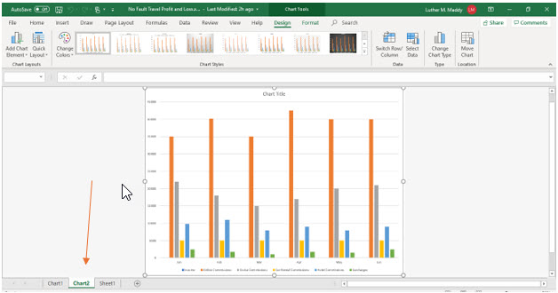
Excel automatically adds the column chart to the worksheet with the values. You will move it to a sheet by itself like the other chart.
4. Click the Move Chart tool on the Design tab and choose to move the chart to a new sheet.
Notice that the sheet for this chart will be automatically named Chart2.
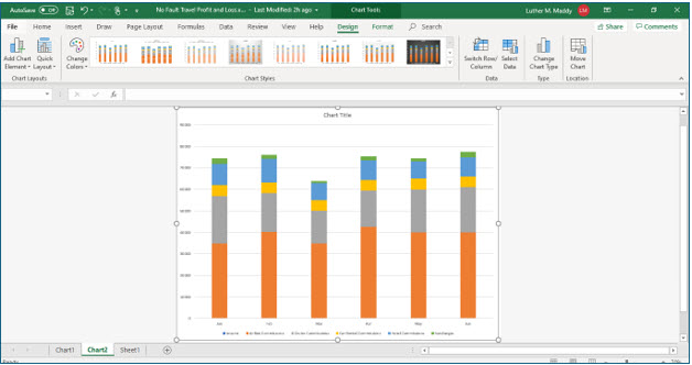
You should now see the column chart with multiple data series. You will now change the chart type to a stacked column chart.
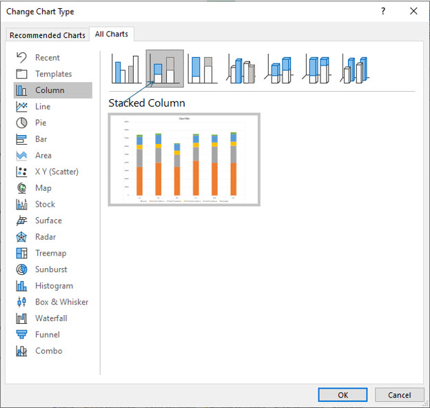
5. Ensure the Design tab is displayed, then click the Change Chart Type tool.
6. Choose Column as the Chart type. Choose Stacked Column, the second one in the first row as the sub-type, and click OK.
You should now see that Excel has created a stacked column chart from the data series you selected.
Creating a Pie Chart
Pie charts are most often used to display the makeup of a whole. In this portion of the lesson you will create a pie chart that graphs the total net income (profit) for this six month period and the contribution of each month. The total income for the period will represent the entire pie and each month will be a slice of the pie. After you have created the pie chart, you’ll add some additional enhancements to it.
1. Return to Sheet1 and select cells A3:G3 and A21:G21.
Remember that pressing and holding the (Control) key allows you to select these two noncontiguous ranges. As you did with the other charts, you’ve included labels that will appear on the chart.
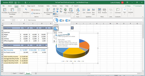
2. On the Insert tab, click the Pie Chart tool and then choose the first 3-D pie chart.
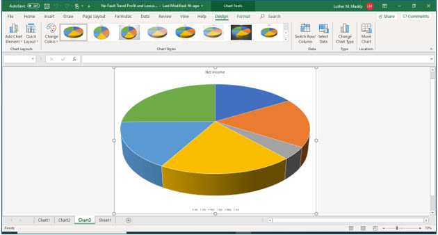
3. Move the chart to a new worksheet.
In addition to clicking the Move Chart tool on the Design tab, you could also right+click the chart and choose Move Chart from the shortcut menu. Excel should label this sheet Chart3.
Notice the labels you included in the selected cells appear as the legend and chart title.
Formatting charts
You’ll now use some of Excel’s formatting features to change the appearance of this 3-D pie chart. In this process you’ll add data labels, remove the legend, and change the 3-D appearance.
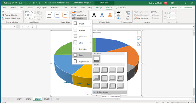
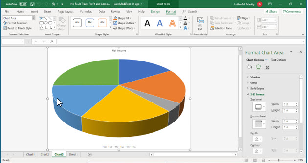
4. Click the pie chart to select it. Then, display the Format tab then click the Shape Effects tool.
You will know the chart is selected because you will see sizing handles around the pie chart. You are looking for sizing handles around the slices of the pie chart, not just the entire chart.
5. From the Shape Effects options submenu, choose Bevel and then 3-D Options.
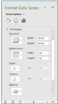
You should now see the Format Data Series pane along the right of the Excel window. If the title is not Format Data Series, close it and repeat Steps 4 and 5 above, ensuring the chart is selected.
6. Change the four width and height settings in the Top Bevel section to 600 points and then close the Format Data Series pane by clicking the “X” to the right of its title.
These settings control how large or small the bevel will be on the chart. Changing them all to 600 points gives the chart a very interesting appearance.
You’ll now remove the legend and add data labels.
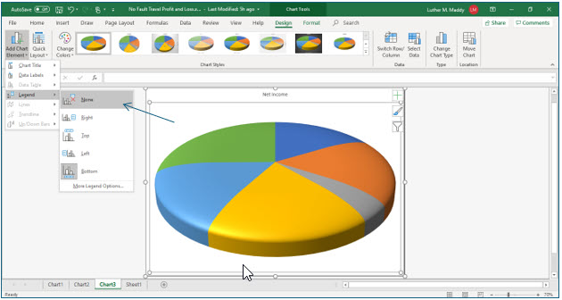
7. Display the Design tab, click the Add Chart Element tool and then choose Legend. From the available options, choose None.
Now that the legend is gone, there is no way to identify the slices of pie. You’ll add data labels that display the month name and also the percentage of profit that month contributes to the whole.
However, instead of having to create a formula using absolute reference as you did earlier, Excel’s charting feature will automatically compute the percentage for you when you create a pie chart.
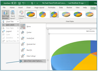
8. Click the Add Chart Element tool and choose Data Labels. Then from the Data Labels submenu, choose More Data Label Options.
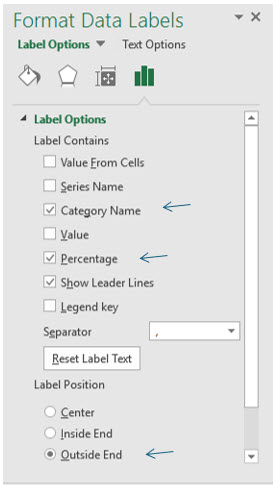
You should now see the Format Data Labels pane on the right of the Excel window. Here you can specify many formatting options for data labels.
9. In the Format Data Labels pane, select Category Name, and Percentage check boxes in the Label Contains section. Turn off all other Label Contains options.
10. Choose Outside End as the Label Position and click Close the Format Data Labels pane by clicking the X.
11. Move to the Home tab and change the size of the data labels to 16 points.
You can do this by ensuring the data labels are selected and then changing the font size on the home tab.
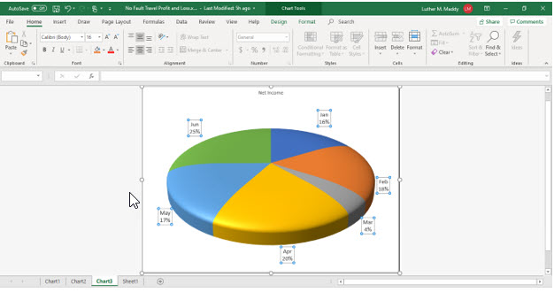
You have now created a pie chart and changed its appearance. This image shows the chart with the formatting pane closed.
11. Save and close the No Fault Travel P&L Workbook.
Congratulations! You have completed the Excel Basics course. Now, take a little time to practice the concepts you have learned with your own values. Then, when you are ready to learn some additional features, you can start Excel 2016 Beyond the Basics to help you become even more productive with Excel.
