Enhancing Excel Charts
This lesson includes step by step instructions to use some of Excel's intermediate charting features including adding a secondary axix and enhanching chart appearence.
Note: These instructions are excerpted from Luther Maddy’s Excel Workbooks (C) 2024 which are available in printed or eBook format from Amazon.com
Download TripData to complete the lesson
Enhancing Excel Charts
Creating charts and graphs is easy with Excel; simply select the cells containing the data you want to include and insert the chart. In this lesson, you will become more proficient creating charts with Excel. You will add additional data series to a chart, create a combination chart, insert a secondary axis, and use more advanced annotating and formatting features.
You will begin this lesson by creating a column chart in the Travel Report workbook you created in Lesson #2. Our “Beyond the Basics” lessons, like typical Excel work, involve creating a workbook that is changed and added to over a period of time.
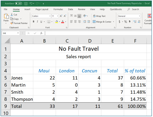
1. Open No Fault Travel Summary Report and go to the January worksheet.
2. On the January worksheet, select cells A5:A8 and E5:E8, the salespersons’ names and total number of trips booked.
Remember, you can use the (Control) key to select non-contiguous ranges.
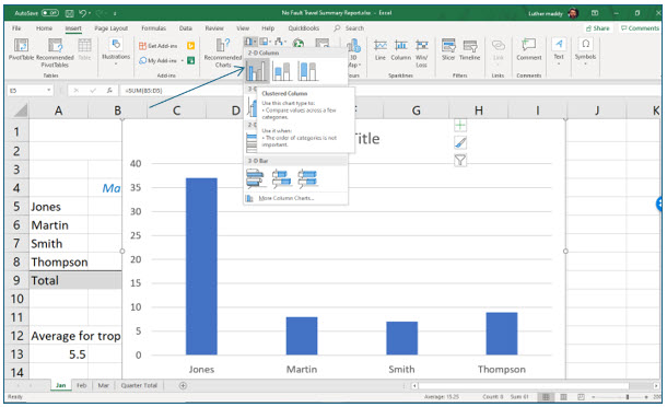
3. In the Charts group on the Insert tab, click the Insert Column or Bar Chart tool. In the 2-D Column list, select the Clustered Column as shown.
Note: When you hover over each chart type on the dropdown menu, the name and description of the chart type will appear.
Excel places the column chart over the data in the worksheet. In the next steps, you will move this chart to a chart sheet, a worksheet dedicated to a chart in Excel.
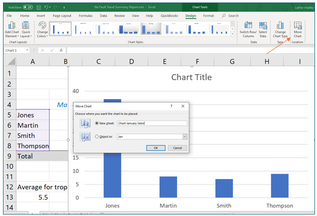
4. Click the Move Chart tool in the Location group on the Chart Tools Design tab.
Excel should display the Move Chart dialog box.
5. In the Move Chart dialog box, select the New sheet option, change the name of the new sheet to Chart-January Sales and click OK.
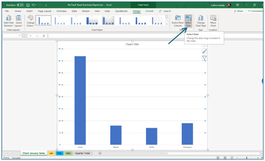
Your chart will now be in a separate worksheet and will not interfere with the worksheet data.
6. Make sure you are viewing the chart, then click the Select Data tool on the Chart Tools Design Tab.
In the next steps, you will add the salespersons’ total booked trips for February and March using the Select Data Source Dialog box.
Adding and editing data series
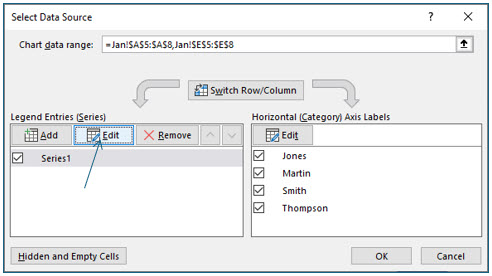
The Select Data Source dialog box allows you to add additional data series to the chart. It also allows you to change a series name and you will change the name of each series to the month name with the Edit tool. Notice in the Select Data Source dialog box, that the data series you charted has been named Series1 by default. If you added a Legend to the chart, the columns representing each salespersons’ total trips booked for January would be identified as Series1.
1. In the Select Data Source dialog box, click the Edit button.
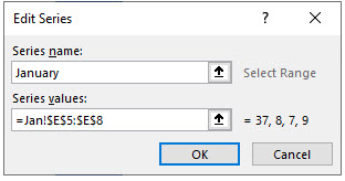
With the Edit Series dialog box, you can change the name of a data series or redefine the cells included in this series. In step 2, you will change the name of this data series to January.
2. In the Edit Series dialog box, type January in the Series name text area and click OK.
The Select Data Source dialog box should remain open. Do not close it. In the next steps, you will add the data series for February and March and name each series by month.
3. Click the Add button in the Select Data Source dialog box.
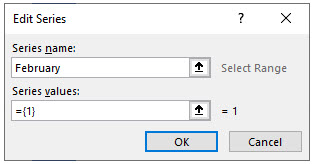
You can add new data series with the Edit Series dialog box that opened when you clicked the Add (new data series) button. You should notice that the Series name and Series values text areas do not contain meaningful values. When you enter a new data series into Series values, but leave the Series name blank, Excel will assign it a default name. However, in the next steps, you will provide the name for each data series that you add, and then you will specify the cells which define in the data series.
4. Type February in the Series name text area and then press the (Tab) key.
When you pressed the Tab key to move to the next entry field, Excel selected the values, ={1}, in this field. When you add another data series, the selection will be automatically erased in Excel. If the values are not selected (indicated by the gray shading), erase the values manually.
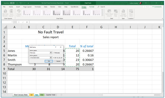
5. Click on the February worksheet, select cells E5 through E8 and click OK.
As you examine the chart you should notice that Excel has added another column that displays the February totals for each salesperson.
6. Click the Add button again. Repeat steps 4 and 5 for the March totals. Click OK to close the Select Data Source dialog box when done.
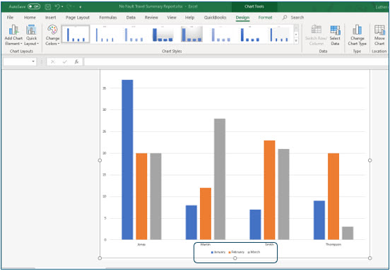
7. In the Design Tab, click the Add Chart Element tool and add a legend to the bottom of this chart.
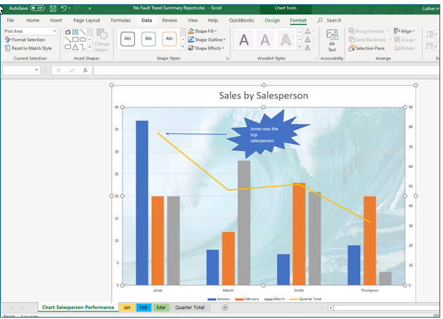
Your chart should appear similar to the one above with three months of data.
After making these changes, the sheet name for this chart is no longer accurate.
8. Double click the chart’s sheet tab and change the tab name to Chart-Salesperson Performance.
Combining Chart Types
You should carefully choose the data for a chart. Creating two different charts may be a more effective way to present data, when the data values can be subdivided in two groups, covering different or widely varying ranges. In this portion of the lesson, we will add a data series the grand total of trips booked for each salesperson for the quarter. Since the salespersons’ quarter totals are significantly higher than the monthly totals, Excel will adjust the value axis (Y-axis) to include the larger numbers. When this happens, the monthly data column will appear much smaller in relation to the grand total.
Combining detail and summary data on the same chart is not usually recommend. However, when this is necessary, Excel allows you to combine chart types, essentially creating two charts in one.
We will add the grand total and use a combination chart to improve the chart’s appearance. The monthly totals for each salesperson will remain charted with columns. When we are done with the exercise, we will chart the quarterly total with a line to distinguish it from the monthly totals and to effectively show trends in salesperson totals. We will also use a separate, secondary value axis for the quarterly total to facilitate easier visual interpretation of both the summary and detail data.
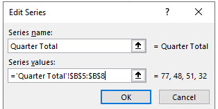
1. Viewing the chart, click the Select Data tool on the Chart Tools Design tab. Then, click the Add button in the Select Data Source dialog box. Name the new series Quarter Total. Select cells B5 though B8 on the Quarter Total worksheet.
2. Click OK on the Select Data Source dialog box to close it.
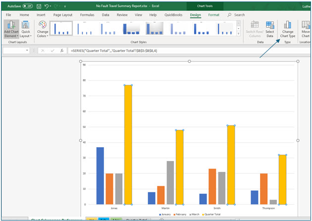
Notice that Excel has charted the quarterly totals as additional columns on the chart. The value axis (Y-axis) has been adjusted to accommodate the higher quarterly totals. The monthly total columns now appear diminished in size; it is more difficult to precisely interpret the monthly total values.
In steps 3-6, you will change the chart type to Line for the quarter totals.
3. Carefully click on any of the Quarter Total columns to select the entire series.
You should notice that all four Quarter Total columns now have small light blue circles in each corner, indicating you have selected this data series. If only one column was selected, click in a blank area of the chart and try again. This step is not necessary to create a custom combination chart, but simplifies modifying the chart to display the Quarter Totals data series as a line chart.
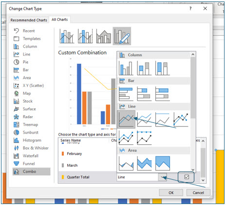
4. Click the Change Chart Type tool on the Chart Tools Design tab.
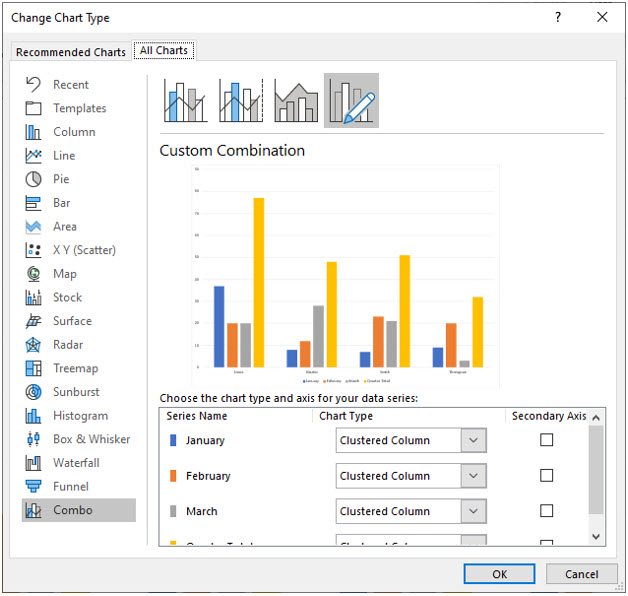
Excel should now display the Change Chart Type dialog box.
5. In the Change Chart Type dialog box, click Combo if needed.
After selecting the Custom Combination, or Combo, chart, you will notice that each data series is listed with two changeable options: the chart type and a secondary axis.
6. In the Change Chart Type dialog box scroll down to select the Quarter Total series. Then, click the drop down list. Choose the first line chart type. Click OK when done.
7. While remaining in the Change Chart Type dialog box, turn on the Secondary Axis check box for the Quarter Total series and then click OK.
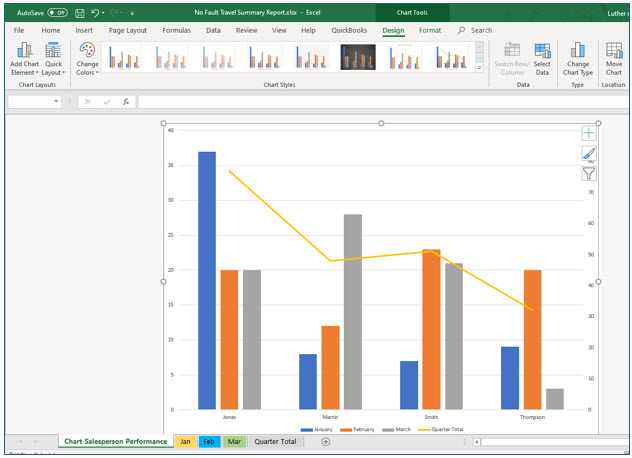
Excel has now changed the chart type for the Quarter Total series to Line. The monthly totals should still be displayed in column chart format. The line representing the Quarter Total series and the columns representing each month’s data series still share the same value axis (Y-axis) because you have not yet selected a secondary axis for the Quarter Total series.
You should see a secondary value axis has been added to the chart for the Quarter Totals series. Excel has also readjusted the primary value axis to a scale which provides greater visual acuity of the monthly total values.
Annotating Charts
You may want to call special attention to a portion of your chart. Excel makes it very easy to add text, objects, and pictures. In this portion of the lesson, you will add some text and other objects to the chart. Most of these features can be accessed from the Chart Layouts group on the Chart Tools Design tab and from the Chart Tools Format tab.
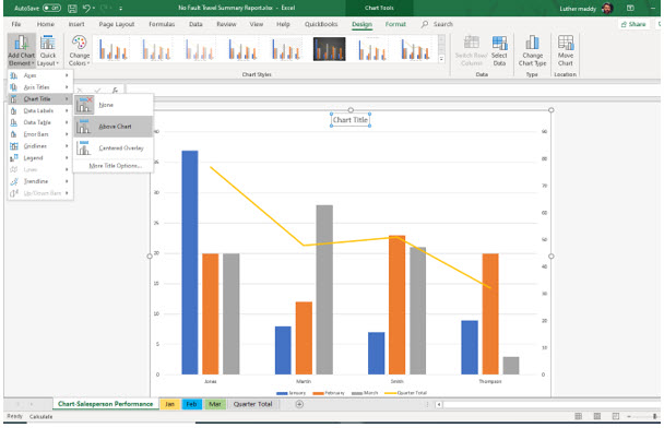
1. In the Chart Layouts group on the Chart Tools Design Tab, Click the Add Chart Element tool. Choose Chart Title and then select Above Chart from the Chart Title dropdown menu.
2. After Excel adds a title, change it to read Sales by Salesperson.
Small blue circles should appear in the corners of the Chart Title text box to indicate it is selected. Simply type the text and press (Enter).
3. After adding the title, select it and change its font size to 24 points.
To change the font size of the title you can return to the Home tab, or right+click on the title and choose Font from the shortcut menu.
In the next steps, you will add an arrow and an explosion shape with text to the chart.
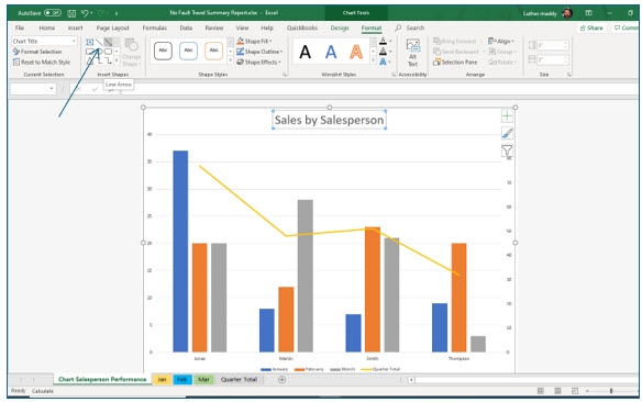
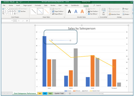
4. Display the Chart Tools Format tab, then in the Insert Shapes group, click the Line Arrow tool.
The line arrow tool is similar to the line tool except that one end of the line has an arrow tip. Format changes to the arrow may be made from the Shape Styles group located on the Drawing Tools Format tab.
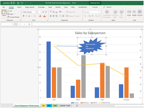
5. Click and drag to draw the arrow as shown in the rounded rectangle, pointing to the total for Jones.
The arrow will appear where your mouse pointer is when you release the mouse. So, to have the arrow pointing left as shown, drag from right to left. After drawing the arrow you will change its appearance to make it thicker.
6. Make sure the arrow you just drew is selected.
You will see sizing circles at each end of the arrow when it is selected.
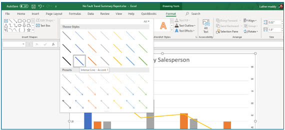
7. In the Shape Styles group, click the Visual Styles, More drop down arrow to display the Visual Styles options menu. Under Theme Styles, choose an arrow in the third row from the top to increase the arrow’s thickness.
Now, you will add an explosion shape at the end of the arrow to explain the purpose of the arrow.
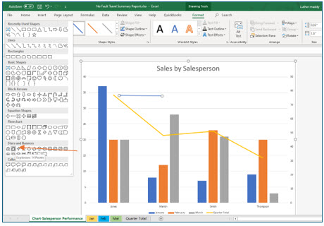
8. In the Insert Shapes Group on the Format tab, click the More drop down arrow. In the Stars and Banners group, select Explosion 14 points.
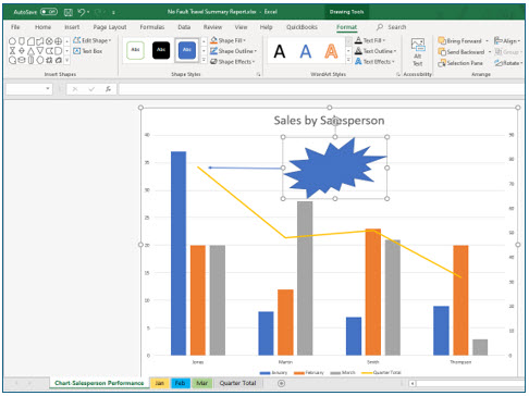
9. Now, click and drag to draw the explosion as shown.
Next, you will add text to the explosion shape by right-clicking on the shape.
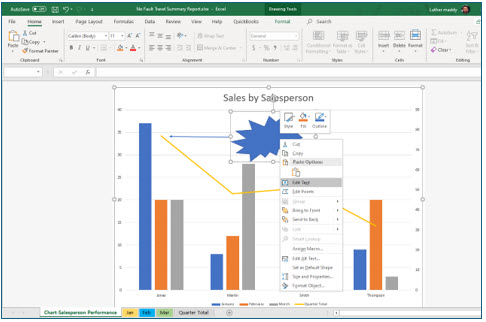
10. Right+click the Explosion2 shape and choose Edit Text from the shortcut menu.
Excel will now let you type text into the shape.
11. In the explosion, type: Jones was the top salesperson.
You may need to move and re-size the explosion shape for the text to fit.
Inserting Images into Charts
Excel allows you to insert picture files, clipart images, or any image such as your company logo in a chart. Images can also be used as the background for the entire chart. In this portion of the lesson you will select a clipart image to serve as the chart background, and then adjust its appearance so that the image does not overpower the information displayed on the chart.
Selecting Chart Elements
Up to this point you have selected different elements of the chart, such as a data series or object, by clicking on it, but not all chart elements are easy to select by clicking. You can also select specific chart elements from the Current Selection group on the Chart Tools Format tab.
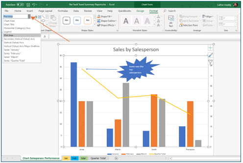
1. Display the Format tab of the Chart Tools. Then, find the Chart Elements drop-down list in the Current Selection group. Click the drop-down list button and choose Plot Area.
You have selected the entire plot area. You will now add a background image to the plot area of this chart.
2. After selecting Plot Area, click the Format Selection tool in the Current Selection group on the Chart Tools Format tab.
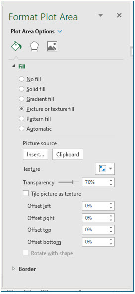
A Format Plot Area task pane should appear to one side of the chart. In the next several steps, you will fill the plot area with an image and adjust the transparency of the image so that your data is still clearly visible.
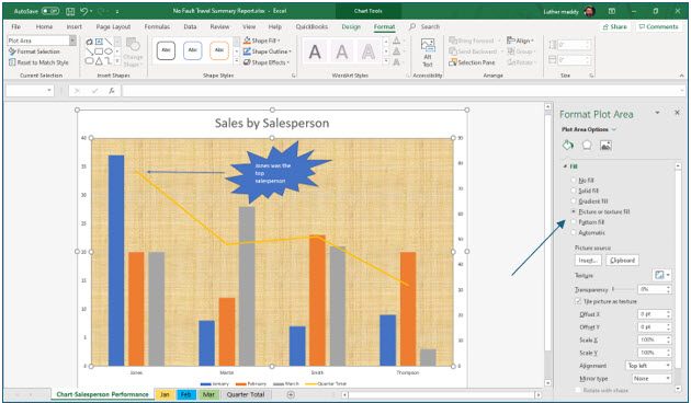
3. In the Format Plot Area task pane, click Fill to see the Fill Options. the Picture or texture fill radio button.
Excel automatically adds a texture to the chart. Excel has several built in textures. You can explore these textures by clicking the Texture tool. For this lesson, you will add a picture background rather than a texture.
4. In the Picture Source area, click the Insert… tool.
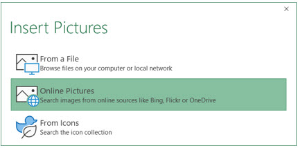
Excel now asks you where you want to find the background picture. You could add one of your own pictures, such as a company logo by choosing the From a File option. For this lesson, you will find a picture online.
5. In the Insert Pictures box, choose Online Pictures.
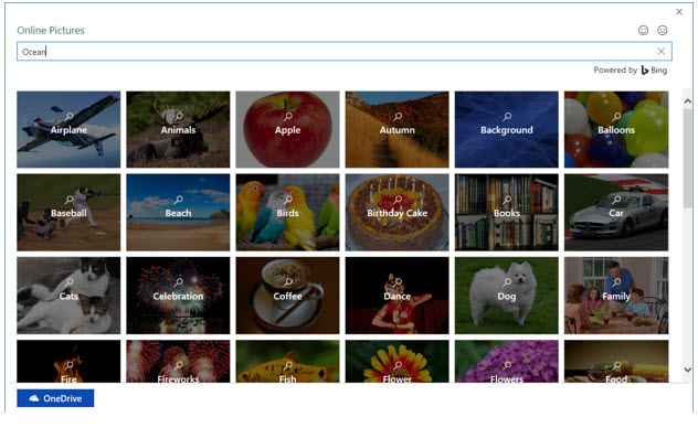
Excel now allows you to search for pictures online to add to the background.
5. In the search textbox, type Ocean and press Enter.
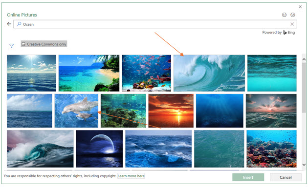
Excel now displays many ocean related pictures. To ensure you do not violate any copyrights, make sure the Creative Commons only checkbox is on.
6. Choose a curling ocean wave or similar image and click Insert.
You may not find the exact picture used in this lesson, but pick something similar or an image you like better.
Excel should return to the Format Plot Area pane. Here you will adjust the image transparency so it does not overpower the chart.
7. In the Format Plot Area task pane, change Transparency to 70% and then close the pane.
The clipart image adjusted to 70% transparency should fill the plot area background.
Creating Sparklines
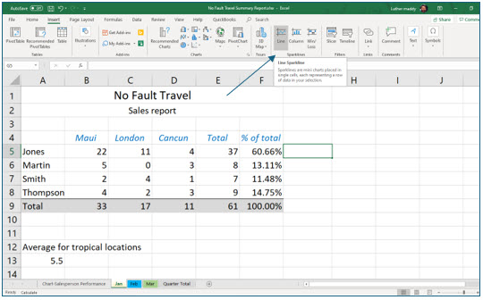
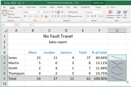
Sparklines are miniature charts that fit inside a single cell. They can be used to quickly see trends and other representations of data. Sparklines have many uses. For this exercise, you will add sparklines to the January worksheet to visually represent the number of trips each salesperson scheduled by location.
1. Move to the Jan worksheet and select cell G5.
You will create a sparkline chart in this cell. After creating the sparkline chart, you will then copy it to the cells for the other sales associates. Like formulas, sparkline charts will adjust when you copy them.
You can create line, column, or win/loss sparkline charts.
2. Click the Line tool in the Sparklines group on the Insert tab.
The next step is to select the data for the sparkline chart and the location.
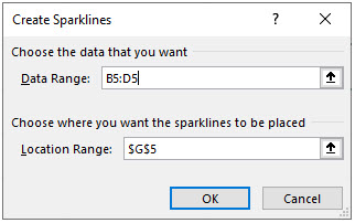
3. In the Data Range of the Create Sparklines dialog box, select cells B5:D5 on the January worksheet.
You have told Excel to create a sparkline using the three trip destinations for Jones.
4. Leave the Location Range as cell G5 and click OK.
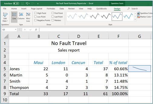
You should now see a Sparkline chart in cell G5.
Because the sparkline chart is tied to one cell, you can copy it like a formula. You will now copy the sparkline into the cells for the other associates and the total.
5. Use the fill handle and copy the sparkline chart into cells G6 through G9 on the January worksheet.
You could also use the Copy and Paste commands to accomplish this too.
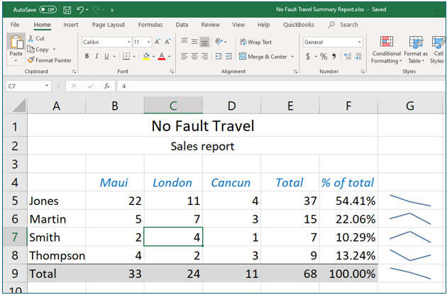
Like other Excel charts, sparklines are dynamic. If you change any data the charts use, they will adjust to show that change.
6. Change the London value for Martin, cell C6, to 7.
You should notice the sparkline for Martin and the total adjusted to reflect this change.
7. Save and Close the Travel Report workbook.
