Descriptive Statistics – Frequencies
This chapter in Surviving Statatistics introduces one aspect of descriptive statistics, frequency distributions. One of the first things you will want to do with your data is count the number of occcurences by category. This is what frequency distributions help you do.
Note: This chapter is excerpted from Luther Maddy’s Surviving Statistics textbook (C) 2024 which is available in printed or eBook format from Amazon.com
Instructional Videos
Video - Lesson #2 Frequency Distributions
Video - Business Statistics Describing Data
Surviving Statistics - File Downloads
Pay Survey with pay rate pivot table
Pay Survey with color test
Descriptive Statistics – Frequencies
One of the first questions to ask about collected data, and one of the easiest to answer, is “How many?” For example, “How many of the people we surveyed like our company’s candy bar better than our competitors when we allowed them to choose?” We can answer these questions by counting. The result of our counts become the frequency of occurrence. We can display the number that chose each candy bar in frequency distributions as tables, charts, or graphs.
Frequency Distributions of Categorical Variables
If the data you are using has categorical variables, frequency distributions summarize the counts of each category. For example, with the favorite color variable, a frequency distribution would show the number of each person surveyed (observations) who selected, red, blue, green, or other color.
FREQUENCY TABLE
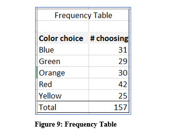
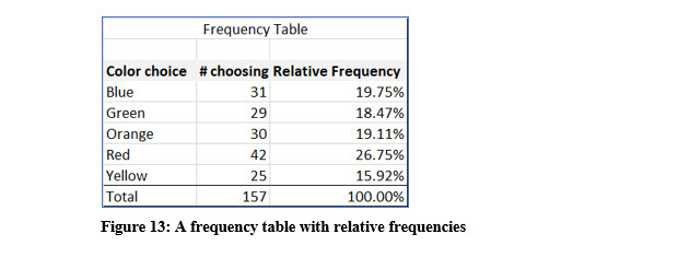
The frequency table in Figure 9 displays every possible choice for the variable and then the count for each. In all, 157 individuals were asked to select their favorite color from a set list of choices. The frequency table reports or describes, how many selected each color. When you create a frequency table, you should sort the category choices to make it easier to read.
Excel as a Calculator
As we progress through this text, we will eventually be doing mathematical computations. Using a calculator to perform those computations can be helpful. My preferred calculator is Excel. As we get into those computations, I will discuss the math behind the formula so you can compute it manually or with a calculator. I will also show you how to do the computation in Excel longhand, and when one is available, with an Excel shortcut. I will also assume you have some basic background in Excel. If you have not worked with Excel before, there are many tutorials and resources available on the web, including those I have created which are on my website and for sale at online booksellers.
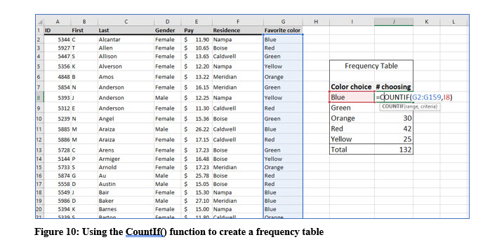
You can use Excel’s CountIf() to count the frequency of occurrence of one categorical value in a large list. You can see this illustrated in Figure 10.
BAR OR COLUMN CHART
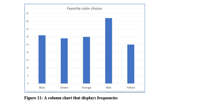
In addition to a table, frequency distributions can be displayed as a bar or column chart which provide a graphical representation of the frequencies.
You can easily create bar or column charts in Excel or other software.
PIE CHART
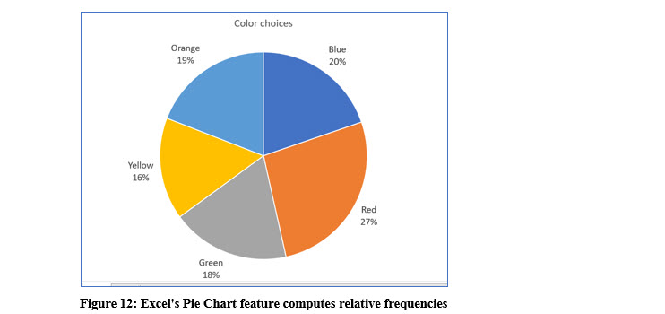
A pie chart is also an effective way to represent frequencies graphically. A pie chart has the advantage of showing how each color choice relates to the choices of all the colors. In other words, a pie chart shows the relative frequency of each choice (color).
Relative Frequencies
The pie chart shown in Figure 12 displays percentages for each color. These percentages are called relative frequencies and are the portion of each category (color) in relation to the whole. The relative frequency is the ratio of each color to the entire number of observations expressed as a percentage.
With the data used to create the pie chart, 42 of 157 people chose red as their favorite color in the list. The relative frequency is then, 42/157 or 26.75%.
To add relative frequencies to a frequency table, divide the number of each category chosen by the total number of observations in the dataset. You can check your math by ensuring that all the relative frequencies total to 1 or 100%.
CUMULATIVE RELATIVE FREQUENCIES
Frequency distributions display the relative frequency for each category. When all the relative frequencies are added, they sum to 1 or 100%. Cumulative relative frequencies add each category’s relative percentage to the category or categories above. The result is still 100%, but 100% is reached with the last category.
As the illustration below shows, blue and green represent 38.22% of the choices. The color choices of blue, green, orange, and red accounted for 84.08% of the choices.
Frequency Distributions for Quantitative Data
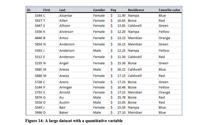
Briefly exam the data in Figure 14. Constructing frequency distributions for the variables gender, residence, and favorite color would be relatively simple tasks because there are a limited number of categories for each these variables. Counting the number of observations that fall into each category and then graphing the frequencies or placing them into a table would not be extremely time consuming and the resulting table or graph would be easy to interpret as we have seen with the favorite color frequency distribution.
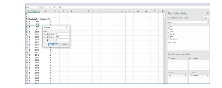
Constructing a frequency distribution table for the variable pay, because there are so many different values would not provide any useful information because the number of occurrences in each pay value would often be 1. You can see a small portion of a frequency distribution of pay values in Figure 15.
To create frequency distributions from quantitative data, especially when you are using continuous variables, it is better to create categories that contain a range of values, rather than counting each value. With the example data in the above illustration, you may decide to group the data by increments of $1. Then, you could count the number of observations from $9.00 to $9.99, $10.00 to $10.99 and so on.
Rather than guessing about the range and how many categories you should use for your values, there is a standard approach in statistics. That approach uses the following steps:
1. DETERMINE K, THE NUMBER OF CLASSES (CATEGORIES)
The classes are the ranges that will include the counts. Following the previous example with the “guessed” increments, there would be 17 classes with a range of $1 because the data ranges from 10.65 to 27.10. Again, rather than guessing, there a simple formula we can use to determine the number of classes in a dataset and that depends on the number of observations in the data.
The example dataset with the names, residences, and pay rates is available on the author’s website in Excel format. It is called Pay Survey. It is not necessary to download the file, but you can use it to follow along if you like. The Pay Survey dataset contains 421 observations. The number of observations in the dataset is the key in determining how many classes to use in a frequency distribution of quantitative data.
The rule of thumb in determining the number of classes, k, is 2k >= n (the number of observations). The process is shown in Figure 16 using the 421 observations in the example Pay Survey dataset.
Using this rule, we determine the proper number of classes, or categories for this dataset is 9. Again, we computed k by increasing its value until 2k is a value equal to or greater than the number of observations.
2. DETERMINE THE INTERVAL OR WIDTH
After you have determined the number of categories, k, you need to determine the width or range for each category. We used $1.00 as an example interval range. That may turn out to be correct, but there is there is a formula to determine the width or range.
To determine the range, you need to know the highest, (maximum), and lowest, (minimum), values in the dataset of the variable for which you are trying to create the frequency distribution. Unless you have downloaded the Pay Survey file, you will have to take my word that the highest value is $27.10 and the lowest value is $9.00. When you are working with a large dataset, Excel or other software program becomes very useful.
After we have determined the number of classes, k, and the highest and lowest values in the dataset, we can compute the proper width for each class. The formula we use is:
I (interval) = (Highest value – Lowest Value)/k
So for this dataset, I = (27.10 – 9.00) / 9 = 2.01.
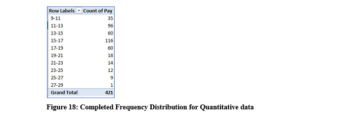
Rounding this to an interval of 2 makes it simpler and easier to work with but doing this we will need to add a class. Otherwise we will miss the values greater than $27.00
The illustration in Figure 18 shows the frequency distribution with k=10 and I = 2 using Excel’s pivot table feature. With a large dataset, counting records manually becomes very tedious.
Try it in Excel:
In Excel, the CountIf() function can also be used to create a frequency distribution.
This formula is =B6-B9.
If you are familiar with Pivot tables, you may want to experiment with them for creating frequency distributions. If you are not familiar with them, there are many resources available, including several Excel workbooks I created to help you master Excel quickly and easily.
